Race
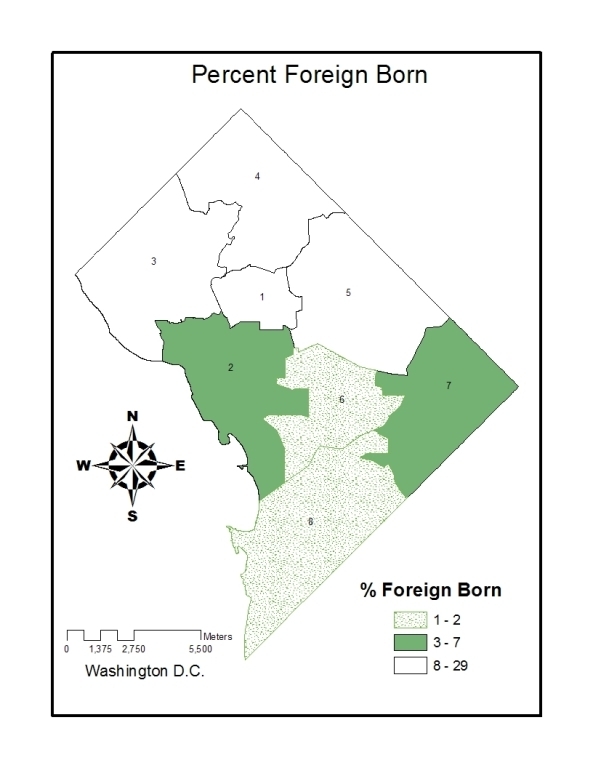
Although there was a negative correlation between the percent foreign born and the AIDS rate [-0.0202] the data still portrayed the affect of economy on the area. From [Table 8, Graph 1] one can see that 80% of the immigrants are in Wards 1, 2,3, and 4. Although this information is surprising at first because the highest AIDS rates are in Ward 1 and 2, Ward 3 is the wealthiest of all the wards. The negative correlation resulted from the immigrants moving closer to Ward 3 to become more affluent.
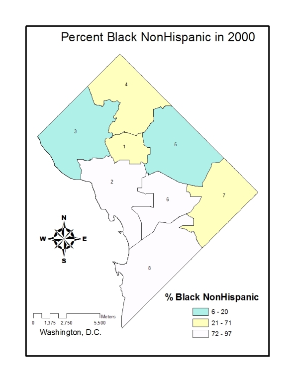
Clearly African Americans are disproportionately infected and the reason is probably multifactor; Economic issues, poverty, education, and rate of drug use. However, the correlation between the AIDS rate and the percent of African American population in each ward was negative. According to [Table 8]The majority of the black community lives in Wards 4 to 8. The relationship between AIDS and the black community is odd because when the AIDS rate increases from 500 to 3,500, the Percent Black remains at 60. Some interesting points on [Graph 2] are in Ward 3 there only 6.2% on the population is black because it is the wealthier ward; therefore the blacks are not identified as the wealthier race in the district.
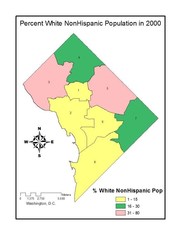
When looking at the demographic information of the percent of the White population in each Ward, some of the wards stand out more than others. The majority of the white population is in Ward 3 (80%) compared to Ward 7 (1.2%). [Table 8, Graph 3] This data would make sense because it is expected for the white population to be in the wealthier area, Ward 3, where the AIDS rate is lowest.