AIDS in the Circle City
Race Correlations
|
|
AIDS in the Circle City Race Correlations |
| Helpful Links
|
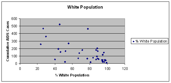
. The first correlation I did involved race. I calculated the percent of the population that was white and the percent that was black. Interestingly enough, both had a significant correlation. The correlation for the percentage of the population that is white was -0.533, well above my required 0.3265. The x-y plot shows that there is, in fact, a negative correlation. For the most part, the lower the white population, the higher the AIDS cases. The one outlier, with the arrow above it, is the zip code that is directly downtown, where there is the second highest number of males living with males in the city.
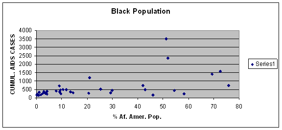
The x-y plot for the black population looks like this: The correlation coefficient for this group was 0.535, almost exactly what the white population’s correlation coefficient was, but a positive one. It is clear that as the percentage of black residents in a county increases, so does the number of AIDS cases. I think it is very interesting to put these two graphs together and see that what was once thought of as a gay, white man’s disease is actually now affecting the African American population more than white one. A population that did not correlate at all was the Hispanic population. I assumed that there would at least be a weaker correlation between the percent of Hispanics and the cumulative AIDS rate. In fact, the correlation coefficient was only 0.012, much lower than necessary for a correlation. I speculated that there are a lot of Hispanics who were not living in Indianapolis during the 2000 census, or they were not counted because they do not have citizenship. |
|
|
|
||