Graph 1.1 Graph 1.2
Correlations
After calculating the AIDS rates in Manhattan, New York State, and the United States, I found that AIDS is a serious problem in this region. Specifically, my zip code 10039, located in Central Harlem, Morningside Heights, has an AIDS rate of approximately 3726.37. This rate is four times higher than the AIDS rate in New York State, which is approximately 893. 51. In addition, the AIDS rate in my zip code is ten times higher than the AIDS rate in the United States, which is approximately 339.71. These calculations led to me wonder what factors were contributing to these high rates in my zip code and neighboring zip codes. Statistics regarding race, income, and education revealed interesting results about the hardest hit population in the Northern half of Manhattan. My analysis of the correlations indicates that the Black population with little to no education and low incomes is the most affected group in the Northern half of Manhattan.
The chosen zip codes
for the correlations are located in the Northern half of Manhattan, starting
from the southern end of Central Park continuing up until the top of the island.
Compared to the zip codes 10001-10020 (southern end of Manhattan), the zip codes
10021-10128 (refer to
Map 1) have relatively low AIDS rates than zip
codes 10001-10020. This is due to the difference in mode of transmission and
number of AIDS cases since 1980. In zip codes 10001-10020, greatest number of
AIDS cases is due to MSM, unlike zip codes 10021-10128, where the greatest
number of AIDS cases is due to IDU. For each correlation, there are two graphs;
the first graph is cumulative AIDS cases and the second graph is living HIV/AIDS
cases.
Graph 1.1
Graph 1.2
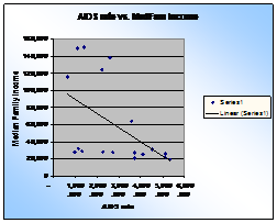
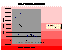
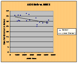
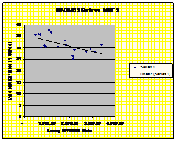
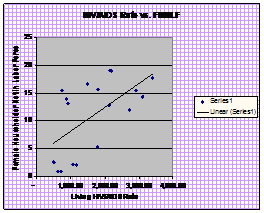
The first correlation I began with was the median family income. I questioned whether the low incomes could be a possible explanation for why the AIDS rate is so high. In Graph 1.1, the correlation for AIDS rate vs. Median Family Income is -0.519, and in Graph 1.2 the correlation for living HIV/AIDS vs. Median Family Income is -0.624. The AIDS rate correlation falls within p<0.01, and the living HIV/AIDS cases falls within the p<0.001.The negative slopes in the graphs show that as the AIDS rate increases, the Median Family Income decreases. The people mostly infected with AIDS are those who have relatively low incomes. People with low income might not be able to afford health insurance, and might not be able to receive information accessible to people who have health insurance. There is a possibility that these people are unable to manage health insurance in their budgets, due to lack of lack of education or simply not have an adequate amount of money. My assumption for the living HIV/AIDS correlation being higher than the AIDS correlation is because the living HIV/AIDS cases are from December 2004 only, with people presently living with HIV/AIDS. The AIDS cases are cumulative from January 1980 to December 2005.
Graph 2.1 Graph 2.2
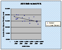
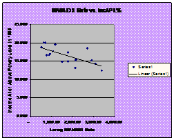
After calculating the first correlation, I began to consider the income at or above poverty level to get a better description of the income designated for the group most affected by AIDS. In Graph 2.1, the correlation is -0.613, and in Graph 2.2, the correlation is -0.699. As the income at or above poverty level decreases, the AIDS rate and the living HIV/AIDS rate increases. These negative correlations imply that the socio-economic status of the residents play a major role in the education status and/or access to information. If the median family income is low, then there are limitations on buying and spending. A person might not be capable of attending a particular school, where they will receive information about STDs and AIDS because of low income. Perhaps, they are unable to buy health insurance, or the health insurance they have, does not cover HIV testing and medications.
Graph 3.1 Graph 3.2
As I reviewed the
correlations for Income at or above Poverty Level, I began to consider whether
people living in this northern part of Manhattan receive any form of assistance
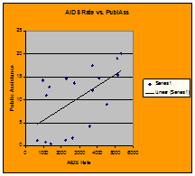
from the government. So I looked at the percentages of Public Assistance in the
selected zip codes. Graph 3.1 has a correlation is 0.606, as in Graph 3.2 the
correlation is 0.711. The AIDS rates and the HIV/AIDS rates fall within the
p<0.708 probability. These positive correlation shows that as the distribution
of public assistance increases, the AIDS rate increases. This implies that the
people in these specific zip codes with the highest amount of public assistance
have the highest AIDS rates. Maybe the people cannot use the items, such as food
stamps, on health-related items and appointments at clinics and hospitals. There
is a chance that the people are restricted by government, in that the people are
only allowed to purchase specific items, such as food and clothing. If they are
struggling at the poverty level, their income may be limited and only used to
purchase necessities.
Graph 4.1
Graph 4.2
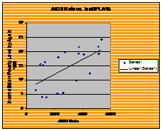
The three previous correlations show that the most affected group with higher AIDS rates are those with relatively low incomes and on public assistance. I began to question exactly which age group was being targeted in this AIDS epidemic. So I looked at the Income below Poverty Level by Age, specifically ages 18-64. In Graph 4.1, the correlation is 0.576, and in Graph 4.2 the correlation is 0.688. These correlations fall within p<0.01 and p<0.001. This positive correlation shows as the AIDS rate increases, the percentage of people below the poverty level within this age bracket increases. During the ages 18-64, a multitude of events occur to possibly contribute to the high AIDS rates. Marriage, infidelity, divorce, career, sexuality, drugs, retirement, and so forth are possible events that take place within that age bracket, all that can contribute to contracting AIDS. Perhaps age groups under the age 18 and below age 64 are not as affected as the ages 18-64. These ages do not experience the same experiences as this specific age group, and therefore maybe too young or too old to be sexually active.
Graph 5.1 Graph 5.2
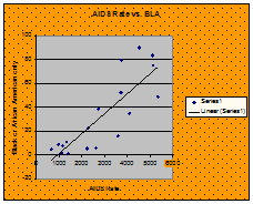
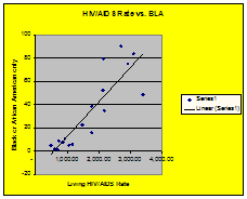
After reviewing the previous correlations, I pressed to find exactly which ethnicity was being targeted. So when I researched the data for the Black population, I was shocked to see that the correlation was so precise. In Graph 5.1, the correlation is 0.837 and in Graph 5.2, the correlation is 0.872. These correlations fall within p<0.001. The Black population is the majority in these specific zip codes and has the lowest amount of AIDS cases in Manhattan, but the highest rate in New York State amongst Whites and Hispanics (according to Table 2). The total population of Black people that live in these specific zip codes is 206, 417. Compared to the White population, their population 458,041, and the Hispanic population the population is 324, 255. Although the size of the Black population is relatively smaller than the Hispanics and Whites, the AIDS rate are still increasing as the population increases.
Graph 6.1 Graph 6.2
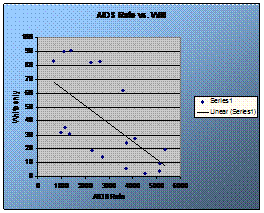
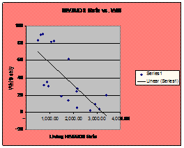
In the southern part of Manhattan, the AIDS rates are extremely high, specifically in SoHo and Chelsea-Clinton. So with curiosity, I chose to find the correlations in the white population in these specific zip codes. In Graph 6.1, the correlation is -0.624 and in Graph 6.2 the correlation is -0.726. These correlations fall within p<0.001. As the AIDS rate increases, the percentage of white people decreases. This is logical because not many white people live in this part of the region. In Table 1, the AIDS rates are the highest in zip codes 10011 and 10018, both located in Chelsea-Clinton. This pre-dominantly white neighborhood shows highest numbers in mode of transmission is Men having Sex with Men (MSM) and Injection Drug User (IDU). But this neighborhood is located in southern part of Manhattan in relation to the size of the population and ethnicity. The White population in zip codes 10021-10128 is 458, 041. They are the m in the area, yet their AIDS rates continued to decrease, unlike the Black population who AIDS rates continue to increase with the size of the population increasing.
Graph 7.1 Graph 7.2 Graph 7.3
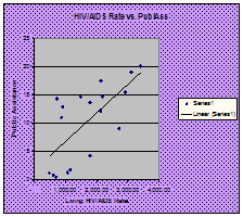
After finding that the
Black population was highly affected in these specific zip codes, I began to
question how many males and females were actually enrolled in school. In Graph
7.1, the correlation is -0.538 and in Graph 7.2 the correlation is -0.612.These
correlations fall within p<0.01. As the percentage of males enrolled in school
decreases, the AIDS rate increases. This negative correlation can contribute to
their lack of information about AIDS and awareness, which could possibly lead
the failure to use condoms. A student could have possibly gone to a poor high
school due to lack of resources that did not focus on sexually transmitted
diseases (STDs), or specifically AIDS. Therefore, they may be unaware of the
precautions that should be taken or the severity of AIDS.
Graph 8.1 Graph 8.2
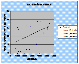
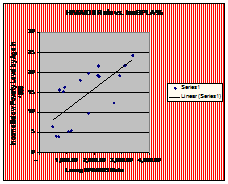
After reviewing the numbers and seeing how the males do not attend school, I wanted to take a different approach for the women. I wanted to see how the AIDS rate would affect those females who were not in the labor force. In Graph 8.1, the correlation is 0.483 and in Graph 8.2 the correlation is 0.595. These correlations fall within p<0.01. The AIDS rate increases as the percentage of females not in the labor force increases. Possibly, females who are incapable of working fit into the category of income below poverty level by age. And if so, they are unable of purchase protection, or simply make daily visits to the doctor because of lack of health insurance. When there is lack of resources, a person is unable to supply themselves with the necessities, such as proper medical care.